
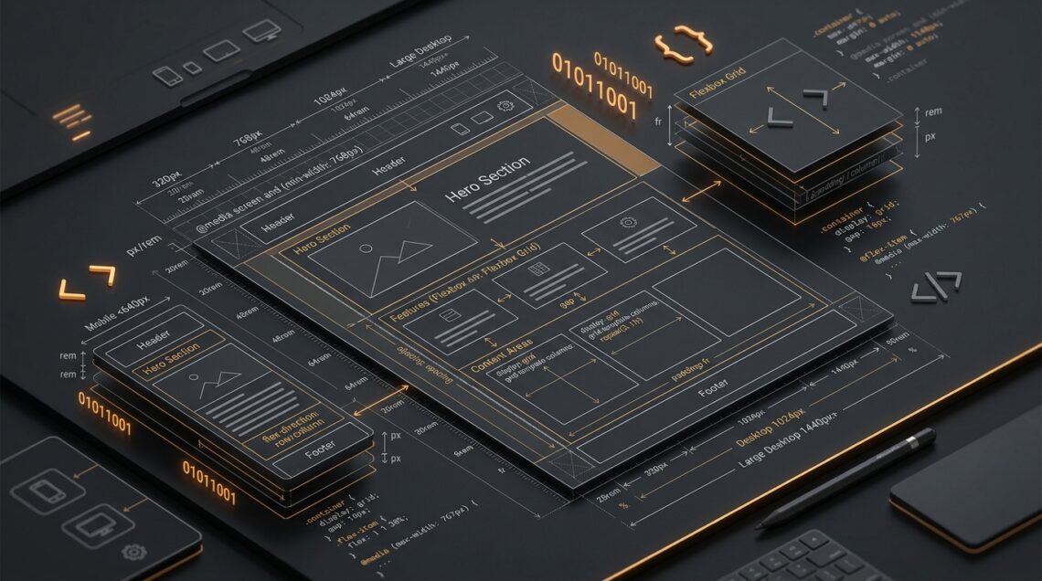
In contemporary full-stack development, user interface engineering and cloud infrastructure management intersect around a shared discipline: mathematical unit precision. From responsive CSS layout viewports to computational RAM bandwidth and database storage boundaries, developers continuously navigate conversions between disparate measurement systems.
Failing to understand the mathematical relationships between relative typography units or binary storage standards leads to broken responsive layouts, accessibility compliance failures, and misconfigured cloud capacity provisioning.
⚡ Try the Interactive Tool
Instantly calculate conversions between Pixels, REM, EM, Viewport Width (VW), Viewport Height (VH), Bits, Bytes, Kilobytes, Megabytes, and Gigabytes:
1. CSS Typography Units: Why REM Supersedes PX
Historically, web developers authored stylesheets using absolute pixel (px) definitions. While pixels provide straightforward visual predictability on standard displays, they fundamentally violate modern web accessibility (a11y) guidelines. Absolute pixels override user-defined browser font preferences, preventing visually impaired users from scaling interfaces appropriately.
Relative root units (REM) solve this by anchoring dimensions directly to the root element’s font size (typically 16 pixels by browser default):
/* Mathematical Formula: REM = Desired Pixels / 16px Base */
:root {
  font-size: 16px; /* Base standard */
}

.headline {
  font-size: 2rem;    /* 2 * 16px = 32px */
  margin-bottom: 1rem; /* 1 * 16px = 16px */
}

.subtext {
  font-size: 0.875rem; /* 0.875 * 16px = 14px */
}
The Critical Difference Between REM and EM
- REM (Root EM): Calculated strictly relative to the
<html>root size. Highly consistent, impervious to component nesting cascades. - EM: Calculated relative to the font-size of its immediate parent element. In deeply nested markup (such as unordered lists or blockquotes), EM values compound exponentially (e.g. 1.2em inside 1.2em becomes 1.44em).
2. Fluid Responsive Typography with Viewport Units (VW/VH)
Modern CSS layout engines enable fluid typography that scales dynamically without relying on aggressive media query breakpoints. By pairing viewport width units (1vw = 1% of viewport width) with CSS clamp() functions, headlines smoothly adapt between mobile and 4K ultra-wide monitors:
/* Fluid Headline: Min 24px, Preferred 4vw, Max 48px */
h1.fluid-title {
  font-size: clamp(1.5rem, 4vw + 0.5rem, 3rem);
}
3. Data Storage Mathematics: The 1024 vs. 1000 Standard
One of the most persistent sources of confusion in cloud storage provisioning and network throughput analysis is the distinction between binary and decimal prefix standards:
| Standard Name | Unit Abbreviation | Base Math | Total Bytes | Primary Usage |
|---|---|---|---|---|
| Kilobyte (Decimal) | KB | 103 | 1,000 bytes | Hard Drive Manufacturers, Network Bandwidth |
| Kibibyte (Binary) | KiB | 210 | 1,024 bytes | RAM Allocation, OS File Systems (Windows) |
| Megabyte (Decimal) | MB | 106 | 1,000,000 bytes | Cloud Object Storage Billing (S3, GCS) |
| Mebibyte (Binary) | MiB | 220 | 1,048,576 bytes | Kernel Memory Buffers, Container cgroups |
This structural discrepancy explains why a commercially purchased “1 TB” solid-state drive (1,000,000,000,000 bytes) reports as approximately 931 GiB when initialized within Windows operating system environments.
Frequently Asked Questions (FAQ)
Should web developers ever use absolute pixels for margin and padding?
For micro-spacing such as thin borders (1px solid) or subtle box-shadows, pixels remain appropriate. However, for element padding, component gaps, and margins, relative units (REM or EM) ensure proportional breathing room when users zoom in.
How can I convert arbitrary CSS units in real time?
Use the Tech Hubs News Developer Unit Converter to compute cross-unit conversions between PX, REM, EM, VW, and data byte matrices instantly.